In response to the critique I was given after my initial draft of ideas I have begun researching ways in which fonts use the idea of space.
Port Typeface (Thick and thin line weight)
http://www.behance.net/gallery/Port-Typeface/6747553
This font in I found on Behance I found particularly fascinating because of the high contrast and juxtaposition of line weight. The thick and thin lines could represent how space is filled and also how minimal space is used. In my own design work I will draft ideas looking into how this could work with my font of use "Futura" and how I could develop this idea to look minimalistic and modern (ideologies of the font).
Typography with filled counters:
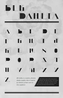
http://www.behance.net/gallery/Blk-Dahlia-A-Modern-Feminine-Display-Typeface/5874251
This font also demonstrates the idea of space and how space can be used due to the font having filled counters on some of the letterforms as well as some of the lines having thick and thin line weight, again showing the high contrast of how lines are used. In my own development I will look at how Futura can be used to fill in some of the space with a block fill.
Empty stems/legs & thin line weight
http://www.behance.net/gallery/French-forge-typeface-FREE-download/11227987
In conjunction with the work researched above I also found this font does show the idea of space due to the thin line weight used and the shapes which are created including stems and legs which are not filled in and left empty. This font is inspiring as I have already been looking at the idea of thin line weight and shape, so by viewing this it has assured me to continue to develop my font design ideas.
Layering
http://www.behance.net/gallery/Strato-a-layered-typeface/9323687
Hand rendered using stock layered
http://www.behance.net/gallery/Atype/11174761
These two typefaces show the idea of layering; both digitally and hand rendered (through using stock layered). Layering could be considered occupation of space because it fills the letter through repetition or slight changes to the letterform inside. Even though the bottom image uses colour I feel that it would work just as effectively using black/white/grey stock.
To conclude; through looking at more fonts and typefaces both digital and hand rendered I have created a wider range of research to inspire me to develop my initial designs by experimenting and including the idea of changing line weight, creating juxtaposition within a letterform, using layering to occupy the letter as well as filling the counters and working with the idea of a solid letter.


No comments:
Post a Comment