Sunday 22 December 2013

OUGD405: Brief 2: Keys

Keys: Key rings/ Key chains

Definition: "a metal ring on to which keys may be threaded in order to keep them together." (function)

Key rings/chains can be used for a number of reasons:

Souvenir, advertising to promote a business (name & logo)- cheap and easy way of 

marketing, personal identity (unique), collectable items (characters/ nostalgia)

 key chains put into cereal boxes to promote films, personal- family photos

car key chains/ fobs, offer other functions (useful).

Other uses:

Ebay's Ultimate Keyring Buying Guide:

"Keyrings are one of those items that everyone has and there are literally thousands of variations that exist. They come in all shapes and sizes, and often serve a purpose that is above and beyond simply something to attach keys to."

"Choosing the Right Keyrings

Keyrings, or key chains, are an extremely important part of life and at the same time one that many people take for granted as something that will just be there.
A keyring holds some of the most valuable assets that you have in life and choosing the right one is a process that not many go through.
Many keyrings are simple in their nature and just do the job of holding a set of keys and nothing else. Other ones are far more complex and there are some that can do all manner of different tasks.
With so many on the market these days there is quite literally one for everyone and the next section looks at the different keyring types available and who they are most appropriate for.

Secure Keyrings

The main function of a keyring is to make sure the keys attached to them are safe.
Caretakers, security personnel and anyone that has to look after large numbers of keys for their profession will need to have one that can take a lot of wear and tear.

Various secure keyrings are introduced in the table below along with a description:"

This means that these types if keyring have a duty and a purpose rather than just their aesthetics. 

"Practical Keyrings

Keyrings can now be obtained to perform a large number of daily tasks and as such a set of keys is now more akin to a swiss army knife than anything else. The table below outlines some of the more popular keyrings available with a short description alongside."

From the larger list further above in this blog post which states different types of practical uses of key rings, this list is much more concise on Ebay (possibly the most used/ bought). For instance the type of person who owns a bottle opener keyring could be completely different to someone who owns a compass keyring (possibly outdoors orientated). 

From my initial ideas of key rings being personal, this further extends on the idea that photographs can be used.

"How secure do the keys need to be that are on the end of the keyring?
Is any level of personalization required?"
From looking at this ebay page I have found that there categories for types of key rings:
Secure keyrings (robust/lasting)
Practical keyrings (other uses)
Personalised (photographs)
Collectable keyrings (of worth)
Luxury keyrings (fashion/wealth)
Commercial keyrings (promotion)

To further research I will look into how these can relate to the type of people using/ buying them and what key rings friends/family have. 

OUGD405: Brief 2: Collect, Categorise, Communicate (Keys)

Must include: 20 facts, 20 opinions, 20 words, 20 statistics, 20 photos. (100)

Keys: Definitions

a small piece of shaped metal with incisions cut to fit the wards of a particular lock, which is inserted into a lock and turned to open or close it.
a shaped metal implement for operating a switch in the form of a lock, especially one operating the ignition of a motor vehicle.
an instrument for grasping and turning a screw, peg, or nut, especially one for winding a clock or turning a valve.
a pin, bolt, or wedge inserted into a hole or between parts so as to lock the parts together.
each of several buttons on a panel for operating a computer, typewriter, or telephone.
a lever depressed by the finger in playing an instrument such as the organ, piano, flute, or concertina.
a thing that provides a means of achieving or understanding something.
an explanatory list of symbols used in a map, table, etc.
a set of answers to exercises or problems.
something that affords a means of access: the key to happiness.

Thesaurus words connected to "keys": 
Access, essential, important, unlocks, answer, solution, clue, idea, heart, authority, entry, route, controlling, indication, significant. 
However I found that these words connected/related to keys tend to form a conceptual and  theoretical solution, this would not work as the brief needs to be something physical or at least relatable. 

I initially began making a design board which included the literal/ initial meaning of keys which includes; what keys are used for (their overall purpose), the history of keys, different designs of keys and their locks, and perhaps looking at the idea of key rings and how keys can be personalised. 

http://www.historyofkeys.com/keys-history/history-of-keys/


From looking at my given word "keys" I asked the class to write down their own opinions on what they thought "keys" represented to them: 
Their answers included; locks, door, padlock/safe, specific design, key words, secrets, key- to show the meaning as something (on a map), locks, diaries, cars, home/safety, revealing something, ownership, protection, treasure, locked away- secrets. 

Other ideas: Music keys (piano), DJ keys (equipment/sound), computer/typewriter keys. These ideas are more specialised, and although incredibly interesting only vaguely relate to my initial word. For research I could of visited the liverpool typewriter museum:
http://liverpooltypewritermuseum.com/gallery

(Own photograph taken in Haddon Hall)

Ideas expressed at interim crit: 
- Keys as a form of decoration- symbolism (necklaces)
- The design of keys to suit their purpose
- The history of keys
- Whats keys are used for and why people find them incredibly useful (mistrust)
- Why people have certain keys to express themselves (colour/style)
- Keys and doors/locks which match in style and material (purpose)

I wasn't sure which direction I wanted to take with my research as I was yet to find something I was interested in expressing. In my questions I asked what people thought of when the word "keys" is mentioned (the brief suggests the audience should be engaged). I also asked what they thought would make "keys" interesting as a research subject matter, this is how they answered in my interim crit:

Interim Crit:
-Locks, secrets: I find the definition of it being an object that makes you secure and the history behind keys could be interesting and how the look of them now has changed through the years?
-A key to something (unlocking) could relate to a game? Try to link it to something you like
-Locks, privacy: look at locks as a symbol how we mentally lock things away maybe look at security. 
-I don't find the subject very interesting: I think you should stretch the meaning a bit further and find something you could really make a presentation about.
-Keyboard/ piano, map key (image and text), keys- answers.
-There is potential here, I think the idea of looking into music is cool and every song has a key signature which comes up to 521.
-Possibilities/gives more options, keyboard keys/ map keys.

After reading my feedback for my interim crit I found that for the audience concerned they wouldn't find the subject matter of history and purpose interesting therefore I have thought about researching the idea of key rings as a form of personal identity and functionality, keys have a function which is commonly unnoticed in daily life as most people own at least one key. Key rings not only have a function of keeping keys together from getting lost but can also be used to express likes/ personality of the person who they belong to. I find this idea of personal identity incredibly interesting and want to research this further within this brief. 

Monday 16 December 2013

OUGD405: Edible Type

Edible Type Research

"You are required to produce a piece of EDIBLE TYPE that resembles an existing letterform or glyph.

The piece of EDIBLE TYPE can be created from a bought food substances then crafted into a typographical form or lovingly made by your own fair hands.
You can work independently or as part of a team, maximum team size is three individuals.
Each piece of EDIBLE TYPE should be supported by a broad range of visual investigation in the form of design sheets and notebooks."

Materials/ Food Substances:

I began to search online by looking at the typical food substances that are generally used  for edible type and recipes. 

Jelly: 
http://laughingsquid.com/wp-content/uploads/portada5-640x432.png

Bread/ Toast:
http://www.countryliving.com/cm/countryliving/images/toast-letters-ABFOOD0906-de.jpg

Cheese:
https://blogger.googleusercontent.com/img/b/R29vZ2xl/AVvXsEgPSUfqLJcEmvLAhyphenhyphen9EpNp1e3HmWJsUwDbk8Q0XS2bRUe019ExS47UNjeEVivarjNwg_I6Ein9o0qmJst4BgR6myeoKf32U1BgXp2VXKVfUiTI9lRv40Luqb3nQjnGC1vUjHKzbdxKlyWJO/s1600/nasabento.jpg

Cake:
http://athome.kimvallee.com/wp-content/uploads/2009/10/alphabet_cake.jpg

Games which include type:

Scrabble, Hangman, Word searches (examples)

One of my ideas is to look at the idea of games which use type and try to replicate these in a more informal way through edible food substances. 


Stroop Effect: Word/colour test

Another idea I had was also in the form of interaction with the edible type- to colour the letterforms/words with certain colours which were different to the word. This could work by using coloured icing/ food colouring or jelly.


"The famous "Stroop Effect" is named after J. Ridley Stroop who discovered this strange phenomenon in the 1930s. Name the colors of the words. Do not read the words...rather, say the color of the words. For example, if the word BLUE is printed in a red color, you should say RED."

"The words themselves have a strong influence over your ability to say the color. The interference between the different information (what the words say and the color of the words) your brain receives causes a problem. There are two theories that may explain the stroop effect:
Speed of Processing Theory: the interference occurs because words are read faster than colors are named.
Selective Attention Theory: the interference occurs because naming colors requires more attention than reading words."

http://faculty.washington.edu/chudler/words.html

Wednesday 11 December 2013

OUGD401:Context Of Practice- Advertising

The initial question which was asked at the beginning of the lecture was "is advertising prostitution" 
This is because the advertising industry typically has a lot of negative connotations, this is because it tends to be linked with the idea of capitalism. It is often used as a tool by capitalism to change established views within society. Advertising is also considered manipulative in changing our perception in what we may need or want. 

Advertising doesn't make short term affects to an audience, they usually create a brand identity and modify us over a longer period of time to want to buy a particular product, because we buy into the brand rather than the product itself. 


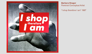
Barbara Kruger is a conceptual artist which creates simplistic type with shocking sentences that make the audience think, this piece in particular shows how materialistic how society has become. A lot of her work is based on feminism, advertising is/ has been known to be sexist towards women but quite recently these roles have been changed and both men and women can/ are now exploited within advertising. This means that advertising is accused to explore sexism by treating people as cultural stereotypes of their own sex. 


These images show how in the past (50s) women were exploited due to capitalism, and now men are also exploited- therefore both men and women are stereotyped by their sex. 

Advertising is known for cleverly connecting products and brands towards our wants and needs. Maslow's hierarchy of need is a diagram that explains human wants and advertising does tend to focus on the idea that a particular product will give you certain things to improve yourself and your own life. The first two sections (physiological and safety) are needs that are met naturally by being alive- however advertising concentrates on the other three which include; love/belonging (friendship, family, sexual intimacy), esteem (confidence, respect) and also self actualisation (creativity, morality). These wants are considered to be used by the advertising industry to make the consumer feel that by buying a particular product they are also improving themselves. 


"Then again does sex actually sell?"


This advertisement plays on the fact that advertising is known to use sex as a form of selling products, many advertisements directed at men often use images of women with little clothing, however this advert uses both sexes and exploits them. These type of adverts are usually aimed at young adults and play on the genetics of human nature to sell clothing. 

However not everything about advertising is negative:

- Advertising drives economy (consumption, sales) this ensures that money is earned and spent and therefore money is being spent. 

- It drives creativity: first wave of creatives wanted to create "utopia" (is a community or society possessing highly desirable or perfect qualities.) The second created persuasive communication to fulfil peoples dreams. 


- It is a very powerful form of art, art feeds advertising and vice versa. 


Rene Magritte's artwork was used for the Volkswagen advert in which is shows the attention to detail within design of their cars. Art can also be a form of advertising on its own, for example pop artist Andy Warhol made campbell's soup incredibly popular due to artwork. 

- Advertising shapes popular culture (apple- iPod)


Another form of advertising shaping popular culture is coca cola and their transformation of the representation of "father christmas" or "santa", they changed him to be slightly larger and to wear red, this also transformed their brand identity as a whole and now the majority of society consider this to be the representation of father christmas. 

- It is endlessly entertaining (film trailers for example)

- It can enlighten or inspire


Advertisements much like these contain shock tactics to create a change of perception and attitudes, this isn't manipulation much like selling products but it is created to change something negative and receive a reaction to raise awareness or raise money. 

- It reflects values, hopes and dreams.

- Challenges you to do something (nike just do it advert).

- Questions social norms and attitudes. 

- Raises social awareness. 

Therefore after this lecture I am now more aware of the fact that advertising can be both positive and negative, it is vitally important for many things in our materialistic lifestyles but also important in our everyday lives too, it can make a difference is a highly effective and powerful artful tool. 

Wednesday 4 December 2013

OUGD405: Brief 1: Typography Examples


http://thebotanist.uk.com
When looking at examples of design which is influenced by the Victorian Era I found that a certain element of modern stores and designs have begun in a revival of traditional techniques and embracing the idea of history and heritage as part of their brand identity. I found that beginning research in Leeds there is a pub/bar which is located within Leeds (near Trinity Centre). Their design has a certain quality and "style" which reflects their brand identity in being aesthetically beautiful and everything being carefully considered/ crafted- food and drink for example. I personally like how they have modernised their designs to appeal to their target audience by digitising their drawings and also their logo. From looking at this I will experiment with scanning and looking at different types of fonts I could use.

http://www.behance.net/gallery/Keepers-of-the-Craft/4638923

I noticed that when looking at further recent designs by users on Behance (creative blogging website) that there seemed to be a higher use of decorative typography. The use of black/white seemed to be used- perhaps to recreate the feel for tradition. The second letterform I looked at was the "h" seen above which uses gold and red tones, this interested me along with the corners of the design, it seemed to frame the highly detailed and frantic nature of the piece. The idea of framing could be used within my own designs through looking at borders and recreating victorian patterns in Illustrator/ editing in Photoshop.


http://www.howdesign.com/design-creativity/fonts-typography/victorian-typography/
From looking at these logo designs I found that the use of ink and paper stock influenced the aesthetics of the designs and therefore this has influenced me into looking at other forms of stock- I will experiment with my designs in printing onto different paper types, including tracing paper, stained/ brown papers and cartridge/ water colour sketching paper (off white and thicker stock).


http://www.behance.net/gallery/New-Sheridan-Hotel-Branding/390305

This example which I discovered on Behance was incredibly successful because it showed as a brand how the work could be used across a wide range of products and not just as the logo. The research was clearly shown into colour choices (from Victorian wallpapers) and also the patterns used follow the same aesthetics and give the brand a certain feminine and established personality. From my own primary research I found a range of different wallpapers and cuttings of decorative patterns which I will scan and begin to work with along with text to create my photo backing papers. 

Monday 2 December 2013

OUGD405: Ideas

From looking at a variety of frames within my research I have found that the most important elements I want to concentrate on is how the audience can be captured. As I have been looking at upper market stores (such as in the Victoria Quarter) I found that the craft of the frame seemed to be highly important, therefore I think the image and the text used should reflect that. I found how Selfridges convey their photo frames is highly interesting because they focus on the idea of the building, I wanted to explore this further perhaps if there was a store that sold photo frames within the Victoria Quarter in Leeds. 


Idea 1: Photographs/ Patterns

From my initial photographs taken within the Victoria Quarter I wanted to further look into the typical patterns and decorative style which is known aesthetically with the era and the type of frames. I often see decorative frames with a historical aura matched with extremely modern backing papers which don't seem to fit and seem disconnected from its target audience. 


Idea 2: Hand Rendered 

As stated in my notes above- one of the ideas I want to focus on is hand rendered design. This is influenced by my visit in Leeds and how I noticed the structure of the building was highly detailed and beautifully crafted. I also saw that there were a variety of wonderful art stores which sold paintings and people were drawn to these- for the images themselves, perhaps an interesting image could capture the interest of the buyer to a frame. I am going to look at different media usage in terms of hand rendered imagery such as water colour, fine liners/ inks and experiment with scanning and printing onto to different stock to see which aesthetically works best. 

http://www.behance.net/gallery/architecture-1/9493557


When researching different types of media I came across this work on the blogging website Behance. The aesthetic of this work is truly beautiful and I feel this type of media would convey well with a wooden decorative frame. This type of imagery would also suit a neutral colour palette and create a sense of history which is true, the Victoria Quarter has been open since the early 19th century. The use of ink/ watercolours within these paintings enhances the little amounts of details used within the architecture and therefore allow the viewer to truly appreciate its craft.  

Idea 3: Typography

My final idea is to make the measurements of the photo frame in focus, I noticed through research that within backing papers the dimensions tend to be incredibly small and not important within the actual design, so therefore I want to include the dimensions as a form of typography. Within this idea I will experiment with creating hand rendered typography and scanning those in, as well as experimenting with scanning in wallpapers and found papers which include patterns which link to the Victorian era and then would therefore portray and help to sell the frame. 

Research:


These screen shots from the Victoria Quarter's website show how they have modernised the Victorian aesthetics which include floral and added decorative extras to design which make them seem incredibly flamboyant and expensive. This is reflective in the target audience intended as it usually is slightly older (middle aged) wealthy people of both sexes but mainly women who enjoy consumed materialistic wealth and the need for expressing wealth through beauty and decoration. 

Advertising/ Typography


http://thegraphicsfairy.com/free-victorian-graphic-gorgeous-typography/

From looking at examples of advertising and typography within this era of design I have found that the need for decoration and expressing wealth and beauty was also present in design as well as architecture and homes. This links to the idea of backing papers of frames, frames usually belong in the home and often are portrayed to be personal, therefore the backing paper must reflect the type of frame it is, not only aesthetically but also conceptually too. The colours used often are off-whites (creams beige and such) along with blacks/ dark browns (considered to be because of print) but also the use of colour is also important, gold, red and certain tones are used throughout designs and these colours connote wealth. In my research into frames in current shops and department stores I have noticed that the type of graphics and the type of frame has an affect onto what designs and colours are used. For example when I initially looked at Wilkinson's frames I noticed that the backing papers were rather simplistic and very colourful, therefore appealing to a larger audience which require cheaper frames and that stores such as Laura Ashley have backing papers which suit their target audience and the price range (middle aged women who are somewhat wealthy).

Victorian Britain, 1837 - 1901- Victoria Quarter in Leeds: "This clever blend between old and new is a key feature of what Victoria Quarter is today"

History (Victoria Quarter):

"The buildings that now house Victoria Quarter are more than 100 years old. During the early part of the 19th Century, the area sold a completely different range of products. Vicar 
Lane was a mass of slaughterhouses, butchers, fruit and vegetable stalls, while the western end of County Arcade housed The Bazaar. This occupied two floors – the lower level selling meat and the upper level trading in fancy goods and haberdashery."
" It was then that the famous theatre architect Frank Matcham, responsible for building more than 200 theatres and music halls, including the London Palladium and Coliseum, was brought into design an elaborate Victorian Arcade. He used rich marbles, gilded mosaics, handsome cast and wrought iron, as well as carved and polished mahogany, to create two streets, an arcade and the Empire Theatre (now the site of Harvey Nichols)."

Target Audience: Female, aged between 20-40/ or older. 
The use of age and an era supplies and fulfils a need for history and an established sense of normality. The use of history allows the audience to feel comfortable, especially of a particular target audience. British history is highly important to its people, this has proved to be incredibly popular through TV series' such as Downton Abbey (Begins Edwardian ear 1912) and Mr Selfridge (begins 1908), which are now aired on ITV as some of the most highly viewed drama's. This allows not only for older people to understand and appreciate but also educate and fascinate young people with culture. Especially within the art and creative industry it has allowed designers to produce work that includes an established set of rules but allows them to break them and push their ideas to create a modern form of twist. 

Wednesday 27 November 2013

OUGD405: Design Processes- Frame (Photoshop)


Most important elements of the brief other than mandatory requirements: 

"Explore a range of concepts in your research and development of your own ideas. Consider the usage, functionality and display within commercial outlets when resolving this problem."

"Not all your investigations should take place on the Mac. Digital image capture methods such as scanning and digital photography allow you to import media from a range of sources (photographs, photocopies, drawings, tracings, found material etc.)"

This means that within this brief when researching and also creating my own designs I will look at ideas which use other techniques such as photography and hand rendered artwork. 

Research:

What is a photo frame and what are they used for? (definition) 

Picture Frame: a framework in which a picture is mounted 
framework - a structure supporting or containing something
moulding, molding, border - a decorative recessed or relieved surface on an edge

And so from looking at these definitions I wanted to further research into what exactly a "frame" means:

a border or case for enclosing a picture, mirror, etc.
a structure for admitting or enclosing something: a window frame.
Usually, frames. used with a plural verb the framework for apair of eyeglasses.
to conceive or imagine, as an idea.


This was a photo frame I recently purchased for my room, it is a brand rather than a store in particular and is a representation of how the backing paper of photo frames are designed. The photographed used in particular is meant to remind the buyer/ consumer of family or friends however it feels disconnected from the viewer. The dimensions and all necessary information however have all been included in a simple grey sans serif font which does match the colour scheme and audience somewhat- it isn't meant to look expensive or upper market. From looking at these types of frames I feel as though I do prefer the high marketed brands or better designed brands because the design is much more clear or creative. 


http://www.wilko.com/search?q=photo+frame&searchsubmit.x=-976&searchsubmit.y=-145

These are also examples of lower budget frames much like the one photographed above from my room. The photo frame on the left includes further photography which isn't connected to the consumer/ target audience, therefore I don't think this is as successful as the frame on the right. The colour palette used matches the frame and could be used on a variety of frames much like this. All the measurements are clear and the design within the frame is simplistic (vectors). However this frame's design I feel wouldn't engage an audience incredibly well because there seems to be minimal connection between the design and the frame. 


John Lewis
http://www.johnlewis.com/john-lewis-frames-black/p324487
I find this use of backing paper especially interesting because as a photo frame, there is no use of image only text. They have cleverly used a famous quote which would represent what type of photographs the customer would put into the frame- rather than forcing photographs with no emotional connection. 


Next
http://www.next.co.uk/search?w=photo%20frame&srt=24


From looking at a wide range of Next's photo frames I found that the majority included either generic photographs of families on holiday/ weddings or much like other stores including the quote "live, laugh, love". However I did find these examples above to be incredibly interesting because they were more artistic and matched their frame. Both frames are white/ decorative and the designer has on the whole created the backing papers well, by using an off white and muted colour palette including purple tones this holds the ideologies of femininity and therefore appeals to its target audience- the majority of photo frames have a target audience for women, elderly people or those interested in photography/ art. 


House Of Fraser 
"Shabby Chic" 
http://www.houseoffraser.co.uk/Shabby+Chic

"In a muted colour palette of washed out pastels and faded neutrals, the collection encapsulates the brand’s love of vintage and admiration for the ‘beauty of imperfection'"


These frames portray the brands identity through its use of colour and imagery. As a whole this brand's target audience is women, through their stereotypically feminine products and use of a muted colour palette (white, grey, pastel tones such as pink). The vector images created on the backing paper of these frames include the logo along with a decorative design which frames the logo. The use of negative space around this highly detailed and intricate design allows attention still to be with the frame. These backing papers are highly successful as they work as a brand- the colour can be changed and processed to fit all types of colour palette (for example those including wood or metal shown above in the screen shot). 

Selfridges & Co


"After 25 years masterminding the redevelopment of Chicago department store Field & Leiter, Harry Gordon Selfridge arrived in London in 1909 with his heart set on opening his dream store.
With his revolutionary understanding of publicity and the theatre of retail, nothing stood still in Harry's empire. If something was new and newsworthy, Selfridges had it first and the store flourished under the direction of its charismatic Chief."
http://www.selfridges.com/en/StaticPage/Our+Heritage/
These photo frames follow along with the idea of history and heritage of Selfridges. As a department store they sell a wide variety of products including a vast choice of frames which include decorative frames and also traditional-looking wooden frames. All these are brought together by the idea of Selfridges as a brand, by using certain type of photography in black and white they continue the ideologies of history. These photographs are on a film camera from when the original store was open in London and therefore the photograph is in context because it is of where it is being sold- and not just a generic photograph of a building. 

From looking at existing photo frame backing papers I have found that when creating my own I need to consider:
The type of frame it is, the shop/ or brand if chosen, the media used/ stock and also its target audience and how the audience will relate and chose this frame. 
From my research I have already thought of a few ideas which include looking at more natural frames (wood) and hand crafted frames which would suit a hand rendered design. I thought about looking into vector graphics (illustrator) and creating a photo frame inside the frame (using photography terms- frame within a frame which is a form of composition). Looking at DSLR black and white photography which would suit a higher market shop/ frame. From thinking of these ideas I will further look into artists who have created similar work to gain inspiration of the media used and stock.