Showing posts with label A Visual Response. Show all posts

Monday, 5 May 2014

OUGD401: Final Piece


As my final design overall I'm quite pleased with the finished outcome, the stock choice definitely works better than using a thin white stock as the off white and texture of the paper makes the product feel quite expensive even though it actually isn't. Making the book and screen printing actually didn't cost an awful lot, however it did take a long while to produce so that is why I left a longer time for production than I did for the actual designing of the pages.

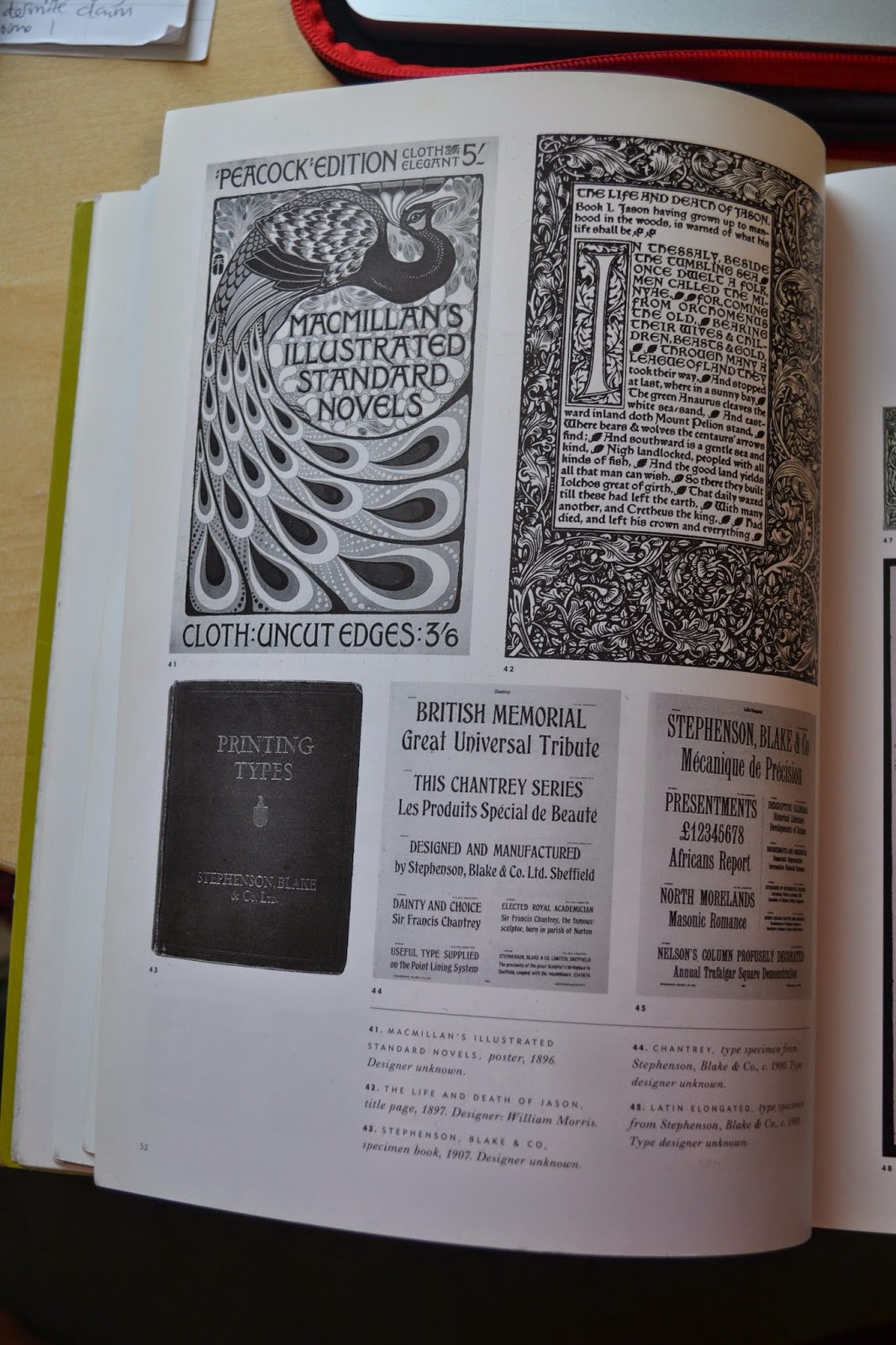
 I'm pleased my work reflects my initial intentions from my essay of wanting to take my own thoughts and what I believe to be correct about the arts and crafts movement and creating something which could be used in todays industry with the aesthetics of the medieval inspired type/design. In terms of the movement as a whole and when I was writing my essay what I really wanted to portray was the socialist principles behind it. Therefore I think by using a variety of different quotes from my essay and William Morris' lectures from my initial research worked incredibly well with the screen-printed and crafted production of my book. In terms of materials I found that Morris began to use extravagant materials for binding which were incredibly expensive and therefore went against the overall principles of art being for everyone. Therefore I think my own design works as being hand rendered and of a good quality, but uses sensible stock choices which aren't overly flamboyant which reflected by using a perfect bound method. 

 I was really pleased that the gradient worked when I tried to create it even though it took several attempts. However there are a few issues which I'm not quite happy with, the pages which use lilac aren't as readable as the others and I think if I were to recreate this I would edit the design of these pages to create more white space. 

Design decisions: 

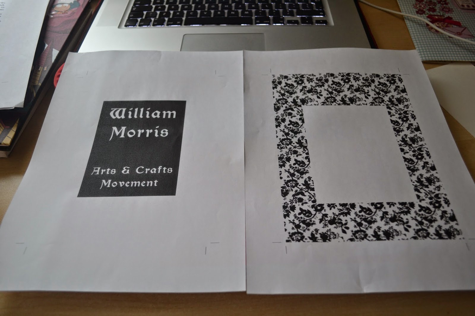
Production: Screen printing, I chose this method to recreate the ideals of the arts and crafts movement through using traditional craft methods which take time and care. I chose screen printing in particular because it allows me to use a whole range of different colours and create a variety of different pages and designs rather than having to use the fonts which are available in my initial choice of letterpress. 

Font: I chose point size 15 for Morris' Gothic this was so that the type could be easily printed using screen print but also highly readable on the page as this type is quite small and delicate for body copy however it does reflect the 15th century inspirations of book/ type design. 
http://www.myfonts.com/fonts/hihretrofonts/morris/

Bind: I chose to use a perfect bind as this simplistic bind is quite cheap to create and is often used in a vast amount of book making. I wanted to make sure my book wasn't too flamboyant in its production to keep the cost to a minimum yet still create a good quality product which led to my stock choice. 

Stock: I actually used a 300gsm canaletto bianco because of it's thickness it made my book feel good quality and the colours contrasted the papers beautifully. I felt that using a thinner white stock was far too harsh and looked quite modern therefore not suiting the overall aesthetics I had researched. 

Colours: I chose my colours from looking at a large amount of William Morris' textiles designs and used a colour picked to choose my favourites to create a feminine and matching colour scheme. (Pink, lilac and blue) When mixing these colours for screen print I used quite a large amount of white to make sure these colours weren't too bright and appeared to be more of a pastel shade. 

Borders and backgrounds: I chose to include floral and natural backgrounds, some of which were from wallpapers I had collected from scrap textiles companies and others I had hand drawn myself. I chose to use these patterns to match the aesthetics I had previously researched from not only Morris' work but also that of the Italian press' books.

Overall I made all these decisions from my research into William Morris and his consistent careful choices of design and craft much like his quote suggests. (Which also appears within my book)

"I found I had to consider chiefly the following things: the paper, the form of the type, the relative spacing of the letters, the words, and the lines; and lastly the position of the 
printed matter on the page."

This brief was an incredibly brilliant opportunity to learn a new skill which is that of screen printing. I had my first try with it in OUGD406 for the alternative movie poster however I really wanted to improve my skills with it. Even though this brief was incredibly challenging to complete in the short time after easter I really enjoyed it. I found that a lot of time was spent waiting for screens to dry and preparation for this process. I really loved creating using screen print and definitely will want to use this again. This brief was also a brilliant opportunity along with the essay to research into areas that I enjoy, personally I love history so to be able to research into lectures and zeitgeist (spirit of the times) was brilliant. I also saw the link with the quotes I used and how they can also be linked to modern day in terms of art and design- it should be cherished and the craftsman/ designer paid a good amount for what they enjoy to do which definitely does link to my own interest into social issues/ change within society. 

OUGD401: Final designs (mock ups)

Mocked up final designs on adobe indesign. To fulfil my design as a piece based on the arts and crafts movement I am going to screen print my book pages.


Positives ready to expose: 


As this a large amount of positives I will need to allow time for the production of my work. 
On tuesday I worked from 9am till 6pm to try and get a large amount of screen printing completed. As the print room was extremely busy I could only obtain two screens which means that I will need to re-expose these two screens as in total I will need 4. It took me a while to figure out how to set out the pages onto the screens but the technicians helped me think it through. I had then figured out to take the work two pages at a time to ensure I didn't become confused with the large amounts of positives. 

On tuesday I managed to get two screens exposed in the morning and in the afternoon I completed two of my pages (pink and lilac) before applying the second colour. I also managed to get the two screens stripped and then re-exposed for the front cover and pages in blue. The print room shut at 6pm so I didn't quite get the second colours finished for the front cover and pages in blue. 

Colours mixed:


An example of one of my screens (lilac):


Screen for pink backgrounds:


First colour complete!


I tried my prints initially onto a white thinner stock as I thought this would work for book pages, however I felt as though the bright white stock against quite a medieval aesthetic didn't fit at all, so I sourced a better stock. 


I decided upon a 300gsm canaletto bianco stock, here I have shown the difference between the two types of paper. I think the off-white thicker stock definitely suits the arts and crafts movement and this brief because it is much thicker and feels a better quality of product- therefore linking to William Morris because as he stated in one of his quotes he always sourced the best materials. 


Because this is only my second time screen printing I had quite a few problems with alignment and the consistency of the colours I had used especially when using a second colour: 


But after a few attempts I really got to grips with the technique and began to feel more confident with my prints. 

In the afternoon of Tuesday 29th April I also did my pages for blue and also the gradient for my front cover: 


Gradient: 


I had a few initial problems of the colours running into each other in a striped manner rather than blended, but after several attempts I finally could get the gradient of colour to work correctly. 


After completing this I cut all the pages up to A5 size and began book binding (perfect bound).


This meant that in total I spent around 10 hours in the print room whether that be screen printing, binding, or waiting for screens to be exposed/ dry. 

OUGD401: Theory Into Practice


The brief as a whole is incredibly detailed and quite challenging in terms of recreating the essay/research content into something fantastic. Therefore to begin researching I will look at initial questions; what is a publication? How is it made (materials/method) ? What is my essay about and how will the content affect the publication?

Firstly, what is a publication?

I did some initial research online which included definitions of what a publication is:

"The act or process of publishing printed matter"

"An issue or printed material offered for sale or distribution" 

"Communication of information to the public"

"The act of publishing a book, periodical, map, piece of music, engraving or the like"

Therefore to connect these descriptions/definitions together the final product must be something physical that can be handled and therefore be real. A publication could be anything so long as it is real and created to have a physical presence such as a book or a series of posters for example. 

Print was explained in a previous lecture to be something real, physical have a presence- therefore the viewer/ audience must interact with it. 

Print is somewhat permanent and can be seen as true:
"I love a ballad in print alife, for then we are sure they are true"
Shakespeare

Essay: "Choosing a particular period from 1800 to present, in what ways has art or design responded to the changing social and cultural forces of that period?"

Within my essay I chose to write about the Arts and Crafts movement of the Victorian era.
I have read back my essay and highlighted some vital points that I need to consider when making my publication. 

Arts & Crafts:


- Well made handcrafted goods instead of mass produced poor quality machine made items.
- Inspired by socialist principles and led largely by William Morris & John Ruskin.
- The relationship between the craftsman and his work. 
- Stay true to the materials used (buildings, homes, books).
- Influences of a medieval style and the beauty of nature (flora fauna).
- Subtle hints of influences in that of original gothic books (15th century).
- Focuses on trying to save art/design from the dehumanising affects of industrialisation.

Materials & Methods:

The arts and crafts movement prides itself in traditional methods and using high quality materials which suits its purpose. Therefore I researched into different forms of printing techniques as I am unfamiliar with these.
I found that there were a whole range of different techniques but those that are available within college facilities include: mono printing, lino cut, etching, screen printing and letterpress. 

Examples:

Monoprint
http://bobcornelis.files.wordpress.com/2008/07/monoprint071008a-copy.jpg

Lino cut: 
http://etsyitemoftheday.com/wp-content/uploads/2009/09/papersquid-Black-and-White-Linocut-Print.jpg

Etching:


https://blogger.googleusercontent.com/img/b/R29vZ2xl/AVvXsEgi3YYzfncIq89QpfZvZCGyOTqojJm3IBmP7XJoDv6jCVfEkmdS6aVTFHP2rXAK2r48TvTWRZLg7rehRBrfGisDejhCRMixGd4ilNLaY14A2qerFFYhVmyLlrmwCPol0A33-HlvpsBC2qRu/s1600/test+etching01.jpg

Screen Print:

http://www.postersandprintsblog.com/storage/Obey%20Rise%20Above%20Rebel.jpg?__SQUARESPACE_CACHEVERSION=1316104168242

Letterpress:

http://www.anthonyburrill.com/images/archive/work-hard/01.jpg

My brother also showed me another technique which is carving into wood, his piece looks fantastic although I don't have the knowledge or equipment to produce anything like this. 


Ideas: 

I wrote my initial ideas onto a large sheet of paper and created a list of them: 


I then focused in on the ones that I thought were the best three.


- Idea one would be to show the way in which a design is produced. For example I think this idea would work best with the letterpress method as seen in the image above I think the idea that the work is shown next to its origin works perfectly and enhances the idea of the craftsman. 

- Idea two could be showing the different ways in which type has been designed through history and show this by using a variety of different methods such as letterpress, typewriter, mac (for example). However I think this idea could work exceptionally well as a project but it is far too difficult to complete in a short amount of time. 

- Idea three is looking at the idea of social impact and using the important quotes from my essay and research to show the principles behind the work. This would mean that the principles themselves would become the focus of the artwork rather than another theme. This would thoroughly portray the arts and crafts era. For this idea I could use more or less any of the methods written above however I think that screen printing could work incredibly well with this due to the ability to add hand rendered drawings into the pieces and also the possibility of colour. 


In terms of the movement as a whole and when I was writing my essay what really intrigued me towards the work was the socialist principles behind it. Therefore I think my third idea will be the most interesting to pursue. Although in terms of materials I found that Morris began to use extravagant materials which were incredibly expensive and therefore went against the overall principles of art being for everyone. Therefore in my own design I will create work which is hand rendered and of a good quality, but uses sensible stock choices which aren't overly flamboyant. 

Book research into type: 


Through looking at this book I noticed aesthetically a strong contrast between the typical Victorian typography and that of arts and crafts. 


From looking at these I have found that the type used within that time was similar to that of 15th century calligraphy (blackletter) but also that of a medieval type. 

I had previously researched into William Morris' work in conjunction with my essay on the arts and crafts movement. Here are a few examples- 

http://gds.parkland.edu/gds/!lectures/history/1850/arts_crafts.html

This book design was an example of what inspired William Morris to create his own books:


Italian printers used borders, headers and decorative initials to liven up undistinguished pages of metal type. This is something I will definitely try to replicate in my own style, the borders make the page more interesting and beautiful however they don't affect the readability of the large amounts of type. 


William Morris was also one of the first to use large type on pages, I think to translate this into my own work I will use smaller quotes into larger type with patterns. 


His work influenced/ inspired the Private Press Movement which raised the standard of commercial printing. This example was a book printed by JM Dent in London, it tries to recreate the craftsmanship of early Italian printers and the arts and crafts movement. 

http://zsr.wfu.edu/special/blog/the-works-of-geoffrey-chaucer-printed-by-william-morris-at-the-kelmscott-press/

I found that the majority of the books are bound through hardbacks using a wide variety of luxury materials such as this one using pig's skin. However I think a flaw with the arts and crafts movement is that the arts and crafts movement wanted the ideal that art and design should be for everyone and assessable for everyone, using luxury binding methods would make the price incredibly expensive. I think when creating my own work I will use a simplistic binding method to fulfil the ideals of the movement. 

Aesthetically The boarders frame the body copy quite beautifully and break up the imagery in quite a perfectly balanced composition. 


http://www.royoung.com/ryb455/images/items//9645.jpg

Again seen here the imagery and backgrounds/borders remind me of etchings and drawings which are hand rendered and crafted. 


The initials which are incredibly decorative make the pages more beautiful in their craft but don't disrupt the actual type itself. I think I will use these decorative initials within my own design along with large amounts of body copy. 


http://hornbakelibrary.files.wordpress.com/2013/05/5-21-2013-4-17-11-pm.png

William Morris uses colour within his pages (red) to highlight certain sections but also to add a difference between the large amounts of black. In my own design I will look at using colours from his textile wallpapers which I will be able to screen print, this is so I will be able to include the idea of beauty in nature (flora/fauna) within the pages. 


http://stoneletters.files.wordpress.com/2012/01/william-morriss-printing-press.jpg

I really want to use this illustration within my own book which I found whilst researching my essay on William Morris' work. 

Wallpapers:


http://selvageblog.blogspot.co.uk/2011/12/william-morris-fabric.html

http://www.artpassions.net/morris/william_morris.html

I chose three swatches of colour to create a colour scheme with the book pages which would compliment each other yet be completely different to black. I initially thought about using neutral colours including light browns and greens which are quite natural however I really loved the contrast of these bright unnatural colours and natural coloured paper/patterns. 


Type used:


http://www.myfonts.com/fonts/hihretrofonts/morris/

front cover developments:


I tried several different backgrounds and variations of gradients on the computer before deciding that I wanted to change the shape of the black on the front cover. By elongating this part of the type it appears more balanced as a whole composition. 

Intro page:


Page one:


From making a few different changes I think am going to screen print this page, I like the way that the I and border matches up. It definitely reflects the research I looked at in terms of borders and the influences of the Kelmscott Press. 

Second page: (continued idea of borders)


I moved the type further down to allow for the type to be more central and then therefore balance out with the background. 

Third page: Large type


I added a border to balance out the whole composition and frame the type. 

Fourth page: 


Fifth page:


I wanted to include a image of William Morris along with one of his most famous quotes, I thought about initially using halftone dots but then I found a drawing which would work wonderfully with this style.


I then used a continuation of the previous purple/lilac background including the white frame which allows for the centred type to appear balanced. 

Sixth Page:


This definitely works better in terms of composition compared to the previous images I had tried, the amount of negative space didn't work well alongside the other pages I have created.