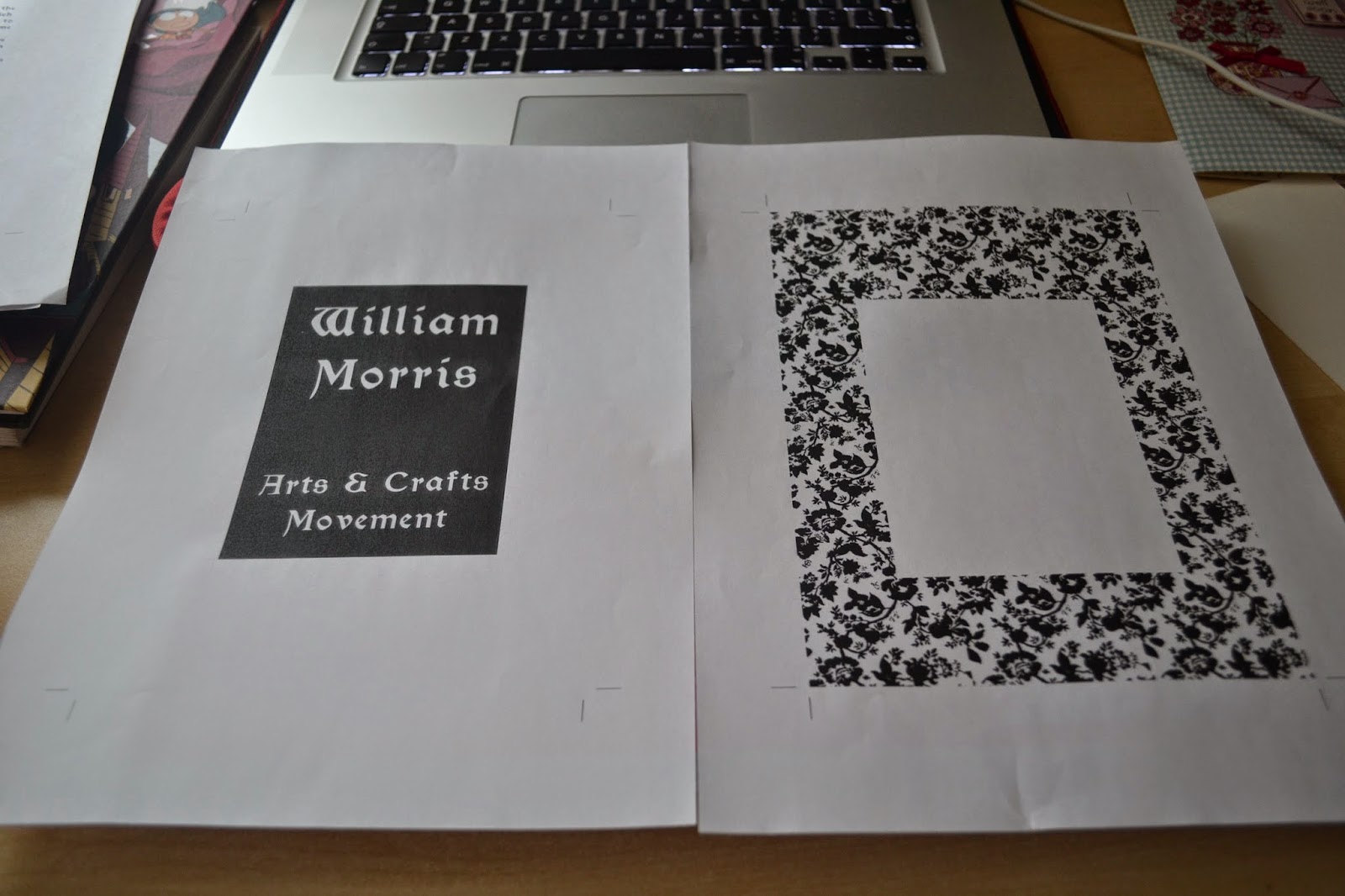
Mocked up final designs on adobe indesign. To fulfil my design as a piece based on the arts and crafts movement I am going to screen print my book pages.
Positives ready to expose:
As this a large amount of positives I will need to allow time for the production of my work.
On tuesday I worked from 9am till 6pm to try and get a large amount of screen printing completed. As the print room was extremely busy I could only obtain two screens which means that I will need to re-expose these two screens as in total I will need 4. It took me a while to figure out how to set out the pages onto the screens but the technicians helped me think it through. I had then figured out to take the work two pages at a time to ensure I didn't become confused with the large amounts of positives.
On tuesday I managed to get two screens exposed in the morning and in the afternoon I completed two of my pages (pink and lilac) before applying the second colour. I also managed to get the two screens stripped and then re-exposed for the front cover and pages in blue. The print room shut at 6pm so I didn't quite get the second colours finished for the front cover and pages in blue.
Colours mixed:
An example of one of my screens (lilac):
Screen for pink backgrounds:
First colour complete!
I tried my prints initially onto a white thinner stock as I thought this would work for book pages, however I felt as though the bright white stock against quite a medieval aesthetic didn't fit at all, so I sourced a better stock.
I decided upon a 300gsm canaletto bianco stock, here I have shown the difference between the two types of paper. I think the off-white thicker stock definitely suits the arts and crafts movement and this brief because it is much thicker and feels a better quality of product- therefore linking to William Morris because as he stated in one of his quotes he always sourced the best materials.
Because this is only my second time screen printing I had quite a few problems with alignment and the consistency of the colours I had used especially when using a second colour:
But after a few attempts I really got to grips with the technique and began to feel more confident with my prints.
In the afternoon of Tuesday 29th April I also did my pages for blue and also the gradient for my front cover:
Gradient:
I had a few initial problems of the colours running into each other in a striped manner rather than blended, but after several attempts I finally could get the gradient of colour to work correctly.
After completing this I cut all the pages up to A5 size and began book binding (perfect bound).
This meant that in total I spent around 10 hours in the print room whether that be screen printing, binding, or waiting for screens to be exposed/ dry.


No comments:
Post a Comment