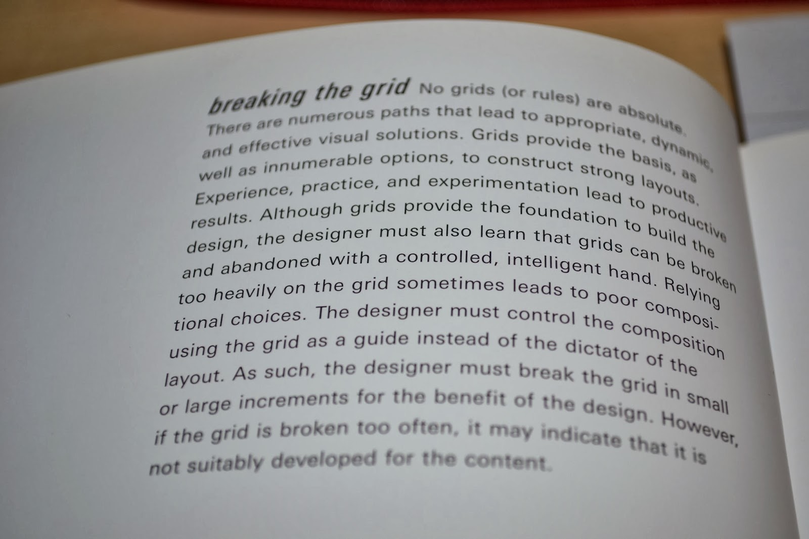
Before beginning this task I loaned a selected few books from the art library to further study layout design and grid systems as before this brief I haven't worked with layout design bearing theory in mind or using indesign.
Through looking at the particular page I found the fundamental elements to grid design which includes; margins (outsides), columns (vertical), grid modules (areas which support where design will be placed), flowlines (horizontal lines to split up the grid), column intervals/ gutter widths (negative space).
This is a further explanation of margins which was incredibly useful, it describes how smaller margins allow for a wider active area and a larger margin decreases the amount of active space but allow for a stable composition which is focused and direct. With this in mind when designing my own page layouts this could work incredibly well in terms of larger margins with sets of photographs.
Within the book, the next piece of advice that helped was looking at grid modules: The page shown as an example is split up into 9 square modules. The layout of these allows for a considered design layout which works perfectly well and is balanced by the text filling the spare grid modules. This is also an idea I think I will possibly consider when working with my photographs as square boxes seem more pleasing to the eye aesthetically than landscape photographs when working in this format.
It is also explained in the book (Layout Workbook) about the different types of common types of grid systems which I have come across before but not fully known the terms of. These include a single column grid system for larger pieces of information and are often used when there are large amounts of text and these are the main focus. Within the examples the text was shown on a double page spread at the bottom and using a photograph in the background which creates a large contrast, I will not be using large amounts of text within this brief however I will bear this in mind in future briefs.
Other types of grid systems include multiple-column grids and modular grids, both of which are similar however multiple-column grids only include vertical lines which work incredibly well with magazine, newsletter/newspaper design however there are usually 3/4 sections to this grid and too many can cause confusion. Modular grids divide the page both horizontally and vertically and allow for a well composed design which is often minimalistic.
These types of grid systems form the basis for layout design however they can also be highly restricting therefore there are alternative grids (using conventional grids and changing some parts) and also quite extremely forms of 'breaking the grid'.
The book also contains a section based on typography within layout design and explains that along with layout, type must be chosen for a purpose and to reflect a certain idea within the design.
Beginning research into layout designs:
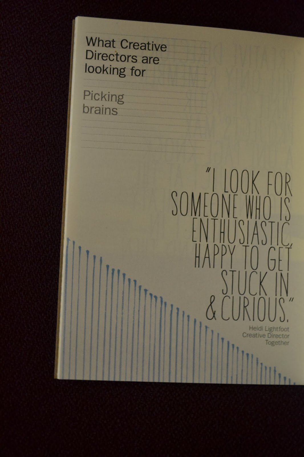
This small booklet was given to me at the beginning of the year due to being a graphic design student, the quirky and illustrative which does reflect the target audience of creatives. The simplicity of neutral tones along with yellow and blue works incredibly well due to the limited colour palette which I will consider along with my own designs. The quirky element to book makes it incredibly personal which suits the advice being given and therefore successful layout design.
Andy Smith Illustration
http://www.asmithillustration.com
His is one of my favourite illustrators and I have pictured a few examples of his work above, and through looking at layout design I figured I would also research how other artists/designers do it and not just in a Graphic Design context. His work tends to compliment bodies of text because it is so bold and highly colourful, it also works well in newspapers and with this in mind I will consider using large type in my page layouts and not just bodies of text.
I saw that photographs can also be used as a form of layout and that text is not always the main focus, I will consider this when creating my layouts and that I could edit my photographs to look completely different which could include changing the opacity and layout into grids.
http://www.behance.net/gallery/Infographic-Diary/12448889
Within this design in particular I liked the use of colour and that the designer has only used black, white and a bright green/blue, I think I will consider this when printing my own page layouts as a limited colour palette could work incredibly well.
http://www.itsnicethat.com/search?utf8=✓&q=book+pages
I also found work by Rob Ryan which is in the form of books, I loved the layout and the idea that he has used the imagery to dictate where the text will be placed and I think it works beautifully well due to the simplicity of the grids.
I have also looked at magazines and zines and look forward to being able to create these in the future as I have only just been introduced to layout design.
In these designs I like the simplicity and the hand drawn technique of the designs which I could consider in other briefs that were more suitable to this style and layout.


No comments:
Post a Comment